Work Single Image
Strategy
Branding
Communication
Activation

Tapita

Context
Project Image
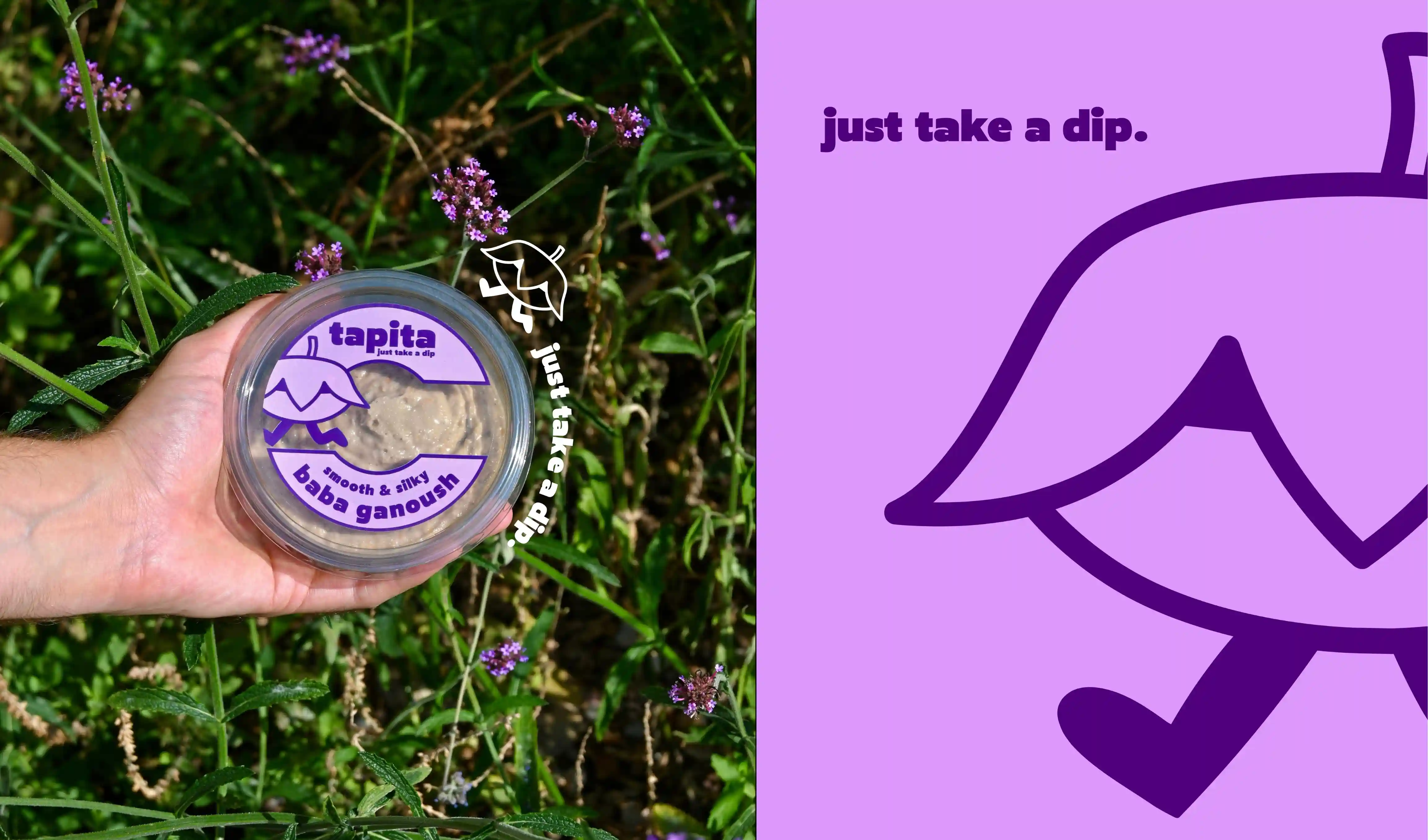
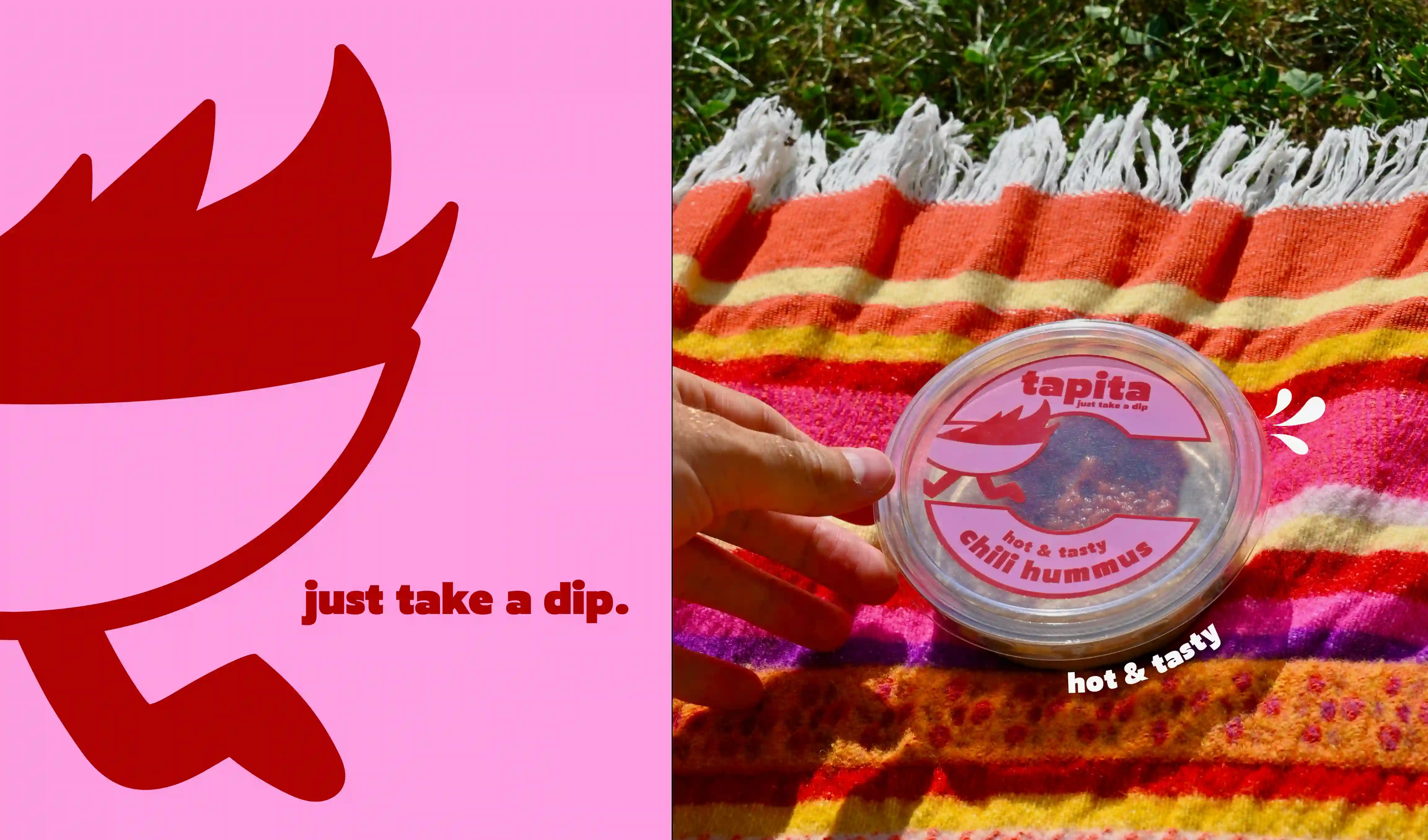
Tapita is a brand of dips and hummus sold at Manor and Migros Partner outlets. The project was launched by Nectra Food with the ambition of creating the new trendy dips brand, capable of asserting itself in a rapidly evolving market.

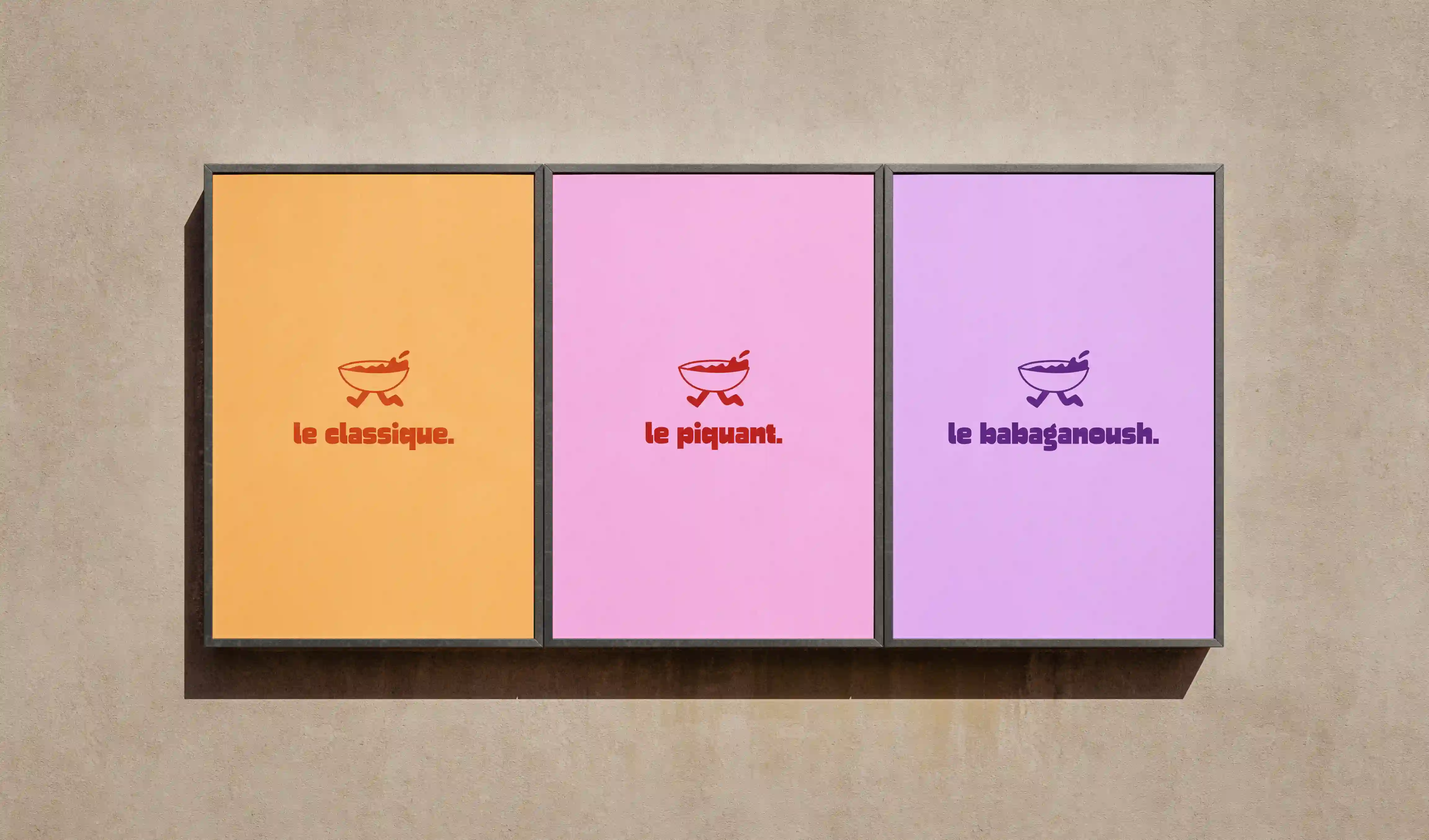
We worked with Nectra Food right from the launch of Tapita, designing the brand's complete identity and developing five ranges of dips with their respective packaging. From the outset, the aim was to create a distinctive universe that would stand out visually and be deployed consistently across all communication media. This collaboration continues today with the creation of new flavors and their visual variations.

Customer
Nectra Food SA
Location
Switzerland
Approach
Understand. Create. Deploy.
Challenge

The challenge was to enable Tapita to stand out in a highly competitive market, by developing immediately recognizable and distinctive packaging. As the brand has no imagined limits in terms of tastes, it was necessary to design a visual system capable of clearly differentiating each variety while preserving a strong, unified overall identity. How do you create an identity capable of embracing an infinite number of variations while remaining coherent and immediately identifiable?

Objective

The objective was to lay the foundations for a distinctive, enduring identity, capable of reflecting Tapita's sunny, gourmet spirit. It had to be deployed consistently across all media, from branding to packaging and communications, while offering the flexibility needed to support the brand's evolution and the arrival of new product varieties.

Solution

The identity reflects a warm, colorful universe, designed to capture attention at first glance. We created the slogan "Just take a dip", a simple, direct invitation that evokes both ease of purchase and the English expression "to take a dip in the water", like a gourmet plunge into the dip itself. The main hand-drawn mascot represents a bowl of dip in motion, embodying the brand's generosity, playfulness and gourmet pleasure. Each flavor has its own variation of this mascot, recalling its taste and reinforcing the visual recognition of the products. The color palette is based on two main hues associated with classic hummus, then enriched by the colors specific to each product to create a rich, vibrant universe that can be found on all packaging.

Your ideas count. We help you turn them into reality.